223
Understanding the Principles
of Design
The basic elements of visual art (line, color, texture, and so on) are mixed, like ingredients, into an image. However, drawing a line or creating space won’t necessarily produce effective art. The elements must be arranged in a way that achieves the intended impact on the viewer. Thoughtful application of design principles produces an effective image. The principles include the following:

- Proportion and scale relate to the size of elements in a visual. Proportion refers to the size relationship of one element to another and to the piece as a whole. The picture to the right compares the size of people to the size of the Gateway Arch. Scale refers to the size of an object in comparison to what is expected. The statue in the Lincoln Memorial depicts the president on a very large scale.
- Unity is the principle of making the different elements of a visual function together to form a complete whole. Unity can be achieved through contrast, alignment, repetition, and proximity.
- Balance refers to the visual weight and distribution of elements. When an image is balanced, its parts complement each other. An off-balance visual can create an uncomfortable effect, but one with symmetrical balance can feel static and uninteresting.

- Direction refers to the visual flow of the composition—how the viewer’s eye moves through the piece. Directional movement can be real or implied. Real direction is literal movement. Implied direction is when non-moving art uses visual techniques to suggest movement.
- Emphasis (focal point) is the area of a composition that first attracts the viewer’s attention, indicating importance.
- Contrast is the juxtaposition of two elements in an image. Contrast can be created using colors, fonts, objects, or images.
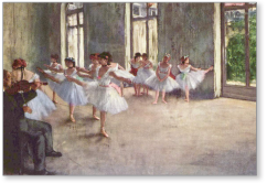
Your Turn How does the painting Ballet Rehearsal by Edgar Degas (above) reflect the principles of design? Write your analysis, making sure you cover each principle.
