228
Understanding Information Graphics
Graphs and charts present facts and figures in concise visual ways, while diagrams offer a clear picture of objects and other structures, highlighting the parts of each and their relationship.
Knowing how to “read” different types of graphics will help you understand and evaluate the information they represent.
Line Graphs and Scatter Plots
Line graphs and scatter plots show changes in amounts over time. Generally an independent variable is represented as a horizontal line (x axis) and a dependent variable as a vertical line (y axis).
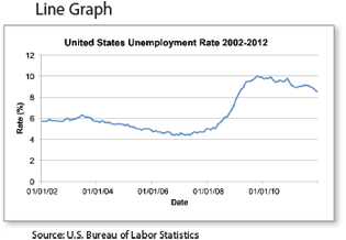
Reading Line Graphs and Scatter Plots
- Study the title and any information below it.
- Review the axes and their labels, especially any units of measure (percent, kilograms, and so on).
- Note the scale of each axis. (Consider the varying starting values of the y axes in the graphs to your left.)
- Check the horizontal and vertical axes for gaps and missing information.
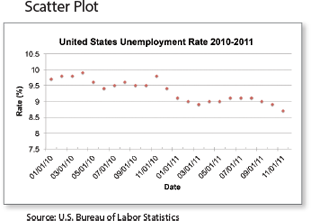 Note the direction of the line or scatter points. Also note any data points that look out of place.
- Consider what predications could be made about future data relating to the graph.
- Check the source of the data (if included).
Your Turn Go online and search for a line graph and a scatter plot related to a subject you are currently studying. Use the tips above to closely read these diagrams.
229
Bar Graphs
Bar graphs are effective for comparing amounts of something or the number of times something occurs. A basic bar graph uses columns to compare groups of data. A stacked bar graph divides each column to show further comparisons.
Bar graphs are common in business and financial reports and documents, because they simplify the relationships between complex data sets. Similar to reading line graphs, bar graph readers should pay special attention to information in the x and y axes. Below are some additional reading tips.
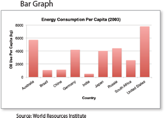
Reading Bar Graphs
- Check the title and any information below it.
- Review the horizontal and vertical axes and their labels.
- Identify the information represented by each bar.
- In a stacked or double bar graph, examine the legend that distinguishes each bar from the next (usually by color).
- Note the scale of each axis. Does the dependent (y) axis start at zero? Are the numbers equally spaced? If the y axis doesn’t start at zero or the numbers are not equally spaced, the information shown may be misleading.
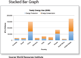
- Check the axes for gaps and missing information.
- Note any trends or major disparities between the bars.
- Identify the source of the information (if available).
Your Turn Go online and search for a regular bar graph and a stacked bar graph related to a subject you are currently studying. Use the tips above to closely read them.
230
Pie Charts
A pie chart shows how something is divided or distributed at a given point in time. The entire pie, or circle, represents the whole sample, and the pie pieces, or sectors, represent its parts. The values of the parts added together must not exceed 100 percent, otherwise the sectors will not form a meaningful whole. The main purpose of a pie chart is to show part-whole relationships.
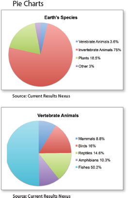
Reading Pie Charts
- Read the title and any information below it.
- Inspect the individual sectors and their relative sizes.
- Inspect the angle of each sector at the center of the chart.
- Examine the numeric data (often a percentage) represented in each sector.
- Make sure the values of the pieces add up to the correct total (usually 100 percent).
- Make sure the slices are mutually exclusive, meaning the information represented by each slice does not overlap.
- Consider what statements you can make about the sectors relative to each other and relative to the whole pie.
- Identify the source of the information (if available).
Note: Reading the relative size of pie sectors is more difficult than reading the relative length of the bars in a bar graph.
Your Turn
- Which of the earth’s species has the highest population? How is that information represented in the first pie graph above?
- What inferences can you make about the mammal population compared to that of other vertebrate animals? Compared to the whole population of Earth’s species?
231
Bubble Charts
A basic bubble chart uses bubbles, or circles, to represent data. The size (area) of the circles corresponds to their value.
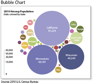
Reading Bubble Charts
- Read the title and any information below it.
- Study the legend or scale to see its relation to the data.
- Read the labels within bubbles.
- Consider how the size, shape, and color of the bubbles relate to the data.
- Note major size disparities between bubbles.
Your Turn In which states do most of the Hmong people who reside in the Unites States live? Why might those particular states attract the Hmong population?
Word Clouds
A word cloud is a graphic representation of the words used in a piece of writing. The most frequently used words appear in the largest type size.
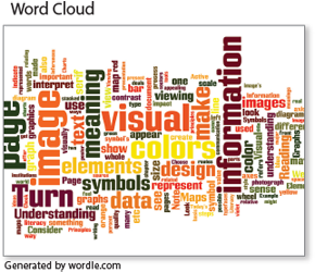
Reading Word Clouds
- Scan the cloud, noting the largest words.
- Look for words that appear in their singular and plural forms, because both forms of the word may appear in the same cloud.
- Evaluate the relationship between the largest words. Are they connected in any way?
Your Turn The word cloud above comes from the text of this chapter. Which words are used most often? How are they related? Create your own word cloud by copying and pasting a section of text into Wordle.net. Which words are largest?
232
Maps
Maps help you get to where you need to go and can display information about the world around you.
Online Maps
Online maps allow you to search for addresses, get directions, and view locations.
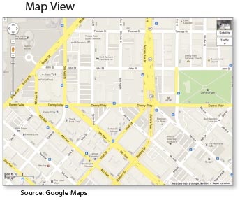
Reading Online Maps
Familiarize yourself with the features of the map:
- The arrows allow you to move the map in any direction.
- The slider lets you zoom in (+) or zoom out (-).
- The scale helps you estimate the distance between points.
- Often you have options for viewing traffic patterns and satellite views.
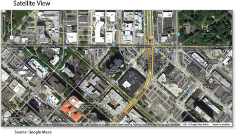
Your Turn Go online to find a street-view and satellite-view map of your local area. Trace your route to school. Then find maps of a place you would like to visit. Write a journal reflection about which view is most useful and why.
233
Public Transportation Maps (Tube Maps)
Transportation maps show public transportation routes.
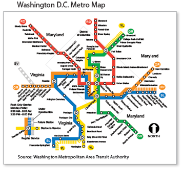
Reading Transportation Maps
- Find your current location on the map and your intended destination.
- Use the map key to determine the colors, letters, and symbols that indicate routes and stops.
- If you need to transfer routes, identify the closest transfer stations.
Information Maps
Information maps use colors or symbols to show geographic data.
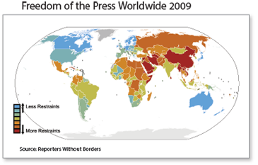
Reading Information Maps
- Note the location of the map.
- Study the map key for its relation to the data.
- Consider how the information is separated (by shades of color, symbols, etc.).
- Look for clustering of colors or symbols in specific regions.
Your Turn In your social studies textbook or online, find an information map. Use the notes above to carefully read and understand the map.
234
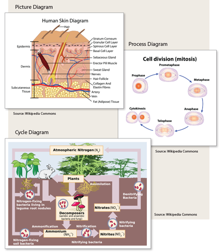
Diagrams
A picture diagram provides a clear picture of the parts of something and how they are arranged. A process diagram visually displays the steps in a process, while a cycle diagram does the same for the sequence of events in a cycle.
Reading Diagrams
When looking at diagrams, pay special attention to all labels, colors, shapes, textures, symbols, scales, arrows, and numbers.