500
To Create an Infographic
- Question the overall situation for the infographic.
- Subject: What is my topic? What specific point do I want to make?
- Purpose: Why am I creating the infographic? To inform, persuade, or both?
- Audience: Who will interact with the infographic? What does this audience expect? How can my infographic engage them and deepen their understanding of the information?
- Plan your infographic, searching the Web for examples and options.
- Research your topic.
- Gather data from reliable print and online sources.
- Decide on the format you will use—map, graph, table, diagram, or other.
- Create your infographic. (See also “Tips for Infographics” on page 501.)
- Prepare the graphic, using the examples earlier in this chapter as a guide.
- Add animation to convey your message if appropriate.
- Give the infographic a title that quickly identifies its contents.
- Provide any necessary keys, labels, or legends.
- Improve your infographic.
- Evaluatethe infographic.
Does the infographic present the most important information about your topic? Is it accurate and complete? Does it use animation appropriately? Does it achieve its purpose? Do readers understand it?
- Reviseyour infographic.
Remove any distracting parts or animation features that do not provide essential information.
Rearrange parts that are out of order.
Redo any parts that are confusing.
Add missing information, titles, legends, or animations.
- Perfect your infographic, making it clean, clear, and accurate.
- Present your infographic online and use social media (see chapter 17) to attract readers. (Go to thoughtfullearning.com/h500 for more information about infographics.)
Note: The term “infographic” is a combination of two words: “information” and “graphic.” Technically, every graphic discussed in this chapter is an infographic, but the term most commonly refers to a graphic display that communicates in a dramatic or unusual way. Many infographics are designed like posters—positioning charts, graphs, time lines, and illustrations in revealing arrangements. Some online infographics also include animation or interactive features. In each case, the purpose is to communicate a body of data quickly and effectively.
501
Example Infographic
The following infographic focuses on the growth of home-based businesses in the United States.
![Home-Based Business in America By Idea Incubator LP ([1]) [CC-BY-SA-3.0 (http://creativecommons.org/licenses/by-sa/3.0)], via Wikimedia Commons](/sites/default/files/inquireHS_images/Chapter30/hs501_1.png)
Tips for Infographics
Use infographics to convey information succinctly and dramatically.
- Gather your data and analyze its implications.
- Consider the purpose of your graphic. Are you comparing data? Illustrating changes? Dramatizing related facts?
- Choose or create a graphic approach that achieves your purpose.
- Arrange your data for special effect.
- Provide a title that attracts attention and reveals the topic.
- Use subheadings, lines, and graphic devices to connect ideas.
502
Additional Example Infographics
This page and the next provide several other examples of infographics. New types are being invented daily.
Animated Map
An animated map shows changes across the Earth’s surface over time. The three images here come from an animated map that tracked the movement of Hurricane Sandy as it crossed the Caribbean Islands and headed for the U.S.
A A rain band shows showers ahead of the storm.
B A cone shows the likely path.
C The dot shows the center of the storm.
D Data for each frame captures the key metrics as the storm evolved.
E The letters denote storm (S), hurricane (H), and depression (D).
F Colors indicate different types of warnings.
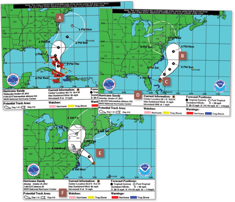
The National Oceanographic and Atmospheric Administration (NOAA), like most federal agencies, provides images like this for public use. Check the use clause on a given agency’s Web site to make sure that you can use images from that agency. (Check out www.noaa.gov.)
503
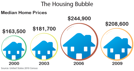
Illustrated Graphs
Illustrated graphs use symbols to quickly communicate abstract concepts. In the graphic below, the housing bubble of 2006 is demonstrated using house icons and bubbles to represent median home prices.
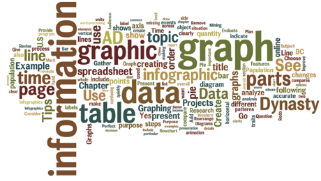
Word Clouds
A word cloud is a cluster of terms used frequently in a piece of writing. The size of each term reveals how often it is used in the writing, indicating its importance. Word clouds are often found on blogs, where they quickly tell what that blog is about.