530
To Create Print Designs
- Question the overall situation for the print design.
- Subject: What message or mood do I want to convey?
- Purpose: Is the project intended to amuse, inform, or persuade?
- Audience: Who will view the design? What do they need from it?
- Medium: Is the design intended for a poster, a T-shirt, a book cover, a pamphlet, or something else? What constraints might the materials impose?
- Context: Where will the design be encountered? How might this affect my design decisions?
- Plan your print design by sketching general possibilities.
- Research your subject.
- Gather needed images and information.
- Organize the elements of your sketch, using these CARP design principles:
Contrast adds visual excitement and distinguishes significantly different elements by employing varying colors, sizes, textures, and fonts.
Alignment avoids a scattershot appearance, arranging separate elements along invisible lines horizontally and vertically to satisfy the viewer’s eye.
Repetition builds unity and identifies related elements by employing similar colors, sizes, textures, and fonts.
Proximity groups related elements for quick viewing and comprehension.
- Create your print design.
- Posters advertise an idea at a distance and provide details up close. See the next page for tips on creating posters.
- T-shirts are intended to be viewed in passing and understood quickly. See the next page for tips on creating T-shirts.
- Book covers grab attention and communicate the essence of their contents. See page 532 for tips on creating book covers.
- Brochures inform and promote. See page 533 for tips on creating brochures.
- Improve your print design.
- Evaluate your design.
Is it attractive? Does it include all necessary information?
Does the design achieve its purpose? Do viewers respond well to it?
- Revise your print design.
Remove or redo any distracting parts.
Rearrange parts that may be out of place.
Add any missing information.
- Perfect your print design, making it clean and correct.
- Publish your print design through a local or online print company. (Go to thoughtfullearning.com/h530 for more help creating print designs.)
531
Poster
This poster asking for student volunteers is designed to draw attention at a distance and then deliver detailed information up close.
A Contrast in colors and a dramatic image draw attention.
B Left and center text alignment adds visual continuity.
C Repetition of colors creates unity.
D Proximity of the final two lines identifies them as a single unit. 
T-Shirt
This T-shirt design advertises an Irish band with an unusual name.
A Contrast between the white lettering and traditional Irish green color pleases the eye.
B Diagonal alignment of the text lines and the line of Irish knots creates continuity.
C Repetition of the knot-work pattern and the Irish font creates unity.
D Proximity of the text (even separated by the band) makes its meaning and word play clear. 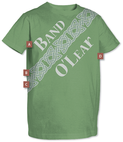
532
Book Cover
The front cover of a book must catch the viewer’s eye. The back must provide more detailed information (summary, price, publisher, and so on). The first image below shows the finished cover of a student-designed book for publication. The second image shows the same cover with its original guides superimposed. Dashed blue lines indicate intended spine folds and edge cuts, tan areas show possible variance, and the yellow box marks space needed for the publisher’s bar code.
Finished Cover, Ready for Publication
A Left alignment of text lines adds visual continuity.
B Contrast between light and dark in the photo background adds interest, as does the choice of font styles and text sizes and colors.
C Alignment of various text elements pleases the viewer’s eye while also making clear the differing functions of different text blocks.
D Repetition of one font style for title text on front, spine, and back creates a sense of unity. Similar repetition of a separate font for subtitle, author, and other text continues that feeling.
E Proximity is used wisely to make discreet units of text on front, back, and spine. 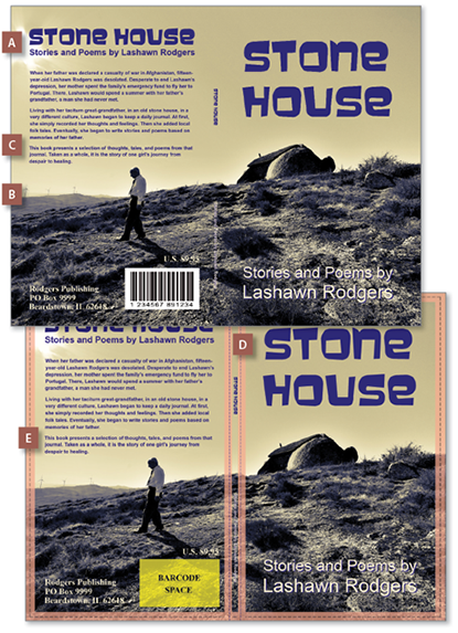
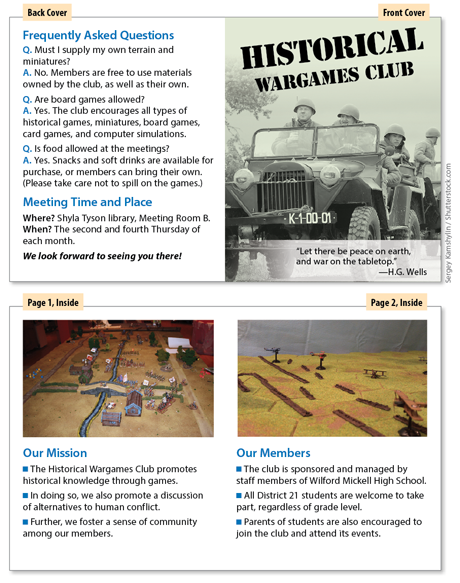
533
Brochure
A brochure’s front cover is much like a book’s. But interior pages may carry more illustrations, like a magazine. The back is often used for a FAQ list and contact details.
Notice how the CARP principles are used—especially the repetition of font choices inside and the use of page divisions to create a proximity of information by topic.