226
Understanding Page Design
Effective design manages visual elements to clarify and enhance the message of the page rather than distract from it.
Page Design Elements
An effective combination of print, graphics, and white space will result in an inviting, balanced page design. The following graphic elements are often employed.
- Bulleted or numbered lists break up long sections of text. When the sequence of items is important, use numbered lists. Otherwise, use bullets. Lists also create white space, which can enhance the readability of a page.
- Headings introduce new concepts. Headings used for similar levels of content should be consistent in type style and size.
- Tables and charts display information; graphs represent data visually (see pages 228-231).
- Photos and artwork visually portray ideas on the page, while diagrams (see page 234) show the arrangement and relation of parts.
Typography
Type size and style affects the readability of a text and the impression it leaves.
- Type size is measured in points. A 10–12 point type is often used for body text, 14–16 point for subheadings, and 16–20 point for main headings.
- Typefaces are either serif or sans serif. In general, printed material (like this book) use serif typefaces for body text and sans-serif typefaces for headings.
Serif typefaces have short projections at the ends of letters. |
The quick brown fox jumps over the lazy dog. |
Sans-serif typefaces do not have end projections. |
The quick brown fox jumps over the lazy dog. |
- Typeface styles vary widely. A standard practice is to use one serif and one sans-serif typeface per document.
Document Type |
Headings |
Body Text |
Print |
Sans-serif fonts (Helvetica, Arial) |
Serif fonts (Times Roman, Georgia) |
Web |
Serif fonts (Times Roman, Georgia) |
Sans-serif fonts (Helvetica, Arial) |
Your Turn Choose a page from your Inquire handbook and analyze its design. Which elements mentioned above were used? Could the design be improved? How so?
227
Principles of Page Design
The document below is attractive and easy to follow. It includes many design elements, such as headings, lists, and boldface type. In addition, it follows the four CARP principles of page design: contrast, alignment, repetition, and proximity.
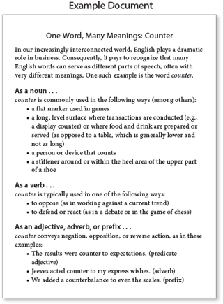
- Contrast deals with the differences between the components of a page. Parts that serve a particular purpose must stand out from other parts.
Example document: The headings feature a different type size and style than the body text uses.
- Alignment deals with the position of page components.
Example document: All the headlines and body paragraphs line up on the left side of the page, and all the bulleted items are indented.
- Repetition deals with consistency in style.
Example document: The subheadings use the same typeface and wording.
- Proximity deals with the spacing between the components of a page.
Example document: Items that are related to each other are grouped together, while items different from each other are separated.
Your Turn
- Print out a copy of one of your recent writing assignments. Consider its design in terms of the CARP principles discussed above: contrast, alignment, repetition, and proximity. How could you improve the design?
- Make any improvements that occur to you and print out a new version. Finally, compare the two versions with a classmate. Discuss the benefits of the new version in terms of readability.