490
To Create a Pie, Line, or Bar Graph
- Question the overall situation for the graph.
- Subject: What information do I want to present?
- Purpose: Why am I creating the graph? To show parts of a whole (pie graph)? To show changes over time (line graph)? To compare amounts (bar graph)?
- Audience: Who will read the graph? What do they need to know?
- Plan your graph, deciding whether you will use a spreadsheet or word-processing program or will create your pie graph, line graph, or bar graph by hand. Gather supplies (graph paper, ruler, compass, protractor) if you are creating a handmade graph.
- Research your topic.
- Gather data and information from experiments, surveys, reports, tables.
- Consider mining data from public sites online (see pages 504–506).
- Organize the information for your graph.
- Create your graph.
- Pie graphs show the parts of a whole. See page 491 for tips on creating pie graphs.
- Line graphs show changes over time. See page 492 for tips on creating line graphs.
- Bar graphs compare amounts. See page 493 for tips on creating bar graphs.
- Improve your graph.
- Evaluateyour graph.
Does it clearly present your information? Is it accurate? Is it attractive?
Does it include a title and clear labeling?
Does the graph achieve its purpose? Do readers understand it?
- Revise your graph.
- Remove any distracting visuals or unnecessary words.
- Rearrange parts that may be out of place.
- Redo parts that are unclear or confusing.
- Add any missing information or labels.
- Perfect your graph, making it clean and correct.
- Use ink to draw the lines in a handmade graph.
- Color the parts effectively or shade them with appropriate black-and-white techniques.
- Present your graph online, in a report, or during a presentation. (Go to thoughtfullearning.com/h490 for more help creating graphs.)
491
Example Pie Graph
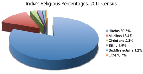
The following pie graph displays the percentages of the population claiming affiliation with various religious faiths in India. This “exploded” pie graph shows segments separated for easier reading.
Tips for Pie Graphs
Use a pie chart to show the parts that together make up a whole.
- Include no more than six sections. The impact is lost if the graph contains too many pieces. Combine smaller amounts in “other.”
- Start at the twelve o’clock position with the largest section and move clockwise in order of descending size.
- Label each section, either within the slice itself (if possible) or in a key to the side (as in the example above). Include percentages or other values as a frame of reference for the viewer.
- Use a spreadsheet or word processing program to create your chart. Enter the values for each pie section into the proper cells; then select a pie-chart display from the software’s menu.
Drawing Pie Graphs by Hand
To draw a pie graph by hand, use the equation below to calculate the degrees for each section, then use a protractor to plot those angles.
- Portion ÷ Whole × 100 = Percentage
- Percentage × 3.6 = Degrees
Example:
- 828,000,000 (Hindus) ÷ 1,029,000,000 (total population) × 100 = 80.5 percent
- 80.5 × 3.6 = 290 degrees
492
Example Line Graph
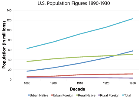
The following line graph records four U.S. population trends from the years 1890 to 1930. Each line tracks changes for a particular segment of the population. A legend beneath the graph explains the use of colors.
Tips for Line Graphs
Create a line graph to track changes in quantity over time. Either draw your graph by hand or use spreadsheet or word-processing software.
- Plot time horizontally. Mark units of time on the x axis (horizontal). This axis also often tracks the independent variable.
- Plot quantity vertically. Mark units of quantity on the y axis (vertical). This axis also often tracks the dependent variable.
- Label the axes for clarity. When possible, position words and numbers horizontally for easy reading.
- Mark a dot for each data point (where quantity and time intersect).
- Draw lines to connect the dots for each category being tracked.
- Create a legend if your graph includes more than one line.
- Identify the various lines with different colors or patterns.
- Give the graph a clear title that includes key terms so that the viewer can grasp its purpose.
493
Example Bar Graphs
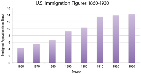
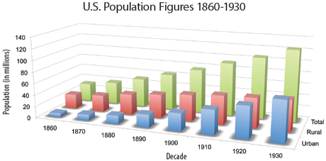
These bar graphs allow readers to quickly compare population figures.
Tips for Bar Graphs
Use a bar graph to compare quantities. Either draw your graph by hand or use spreadsheet or word-processing software.
- Mark points of time or other categories on the x axis (horizontal).
- Mark quantity units on the y axis (vertical).
- Give the graph a title and label the axes for clarity.
- Present your data accurately. Don’t exaggerate or minimize differences.
- Create bars consistent in all measurements except for height.
- Use color or patterns to distinguish categories.
- Use a legend to identify any categories displayed.


