Visual-Literacy Activities
Poster Presentation
You can apply many of the visual/design elements to a scientific poster presentation. A poster presentation offers a visual representation of a scientific abstract by combining text and graphics. Successful posters are visually appealing and present findings in a professional, easy-to-follow, and attractive manner. (You may be able to submit your poster to a contest or present it at a conference. Discuss this with your instructor.)
Your Turn
- Choose a science topic for your poster presentation.
- Carry out your research and experiments.
- Plan how you will display your findings in poster form. Share and discuss ideas with a classmate or your teacher.
- Prepare any graphs, charts, maps, or diagrams you will use to display your findings (see pages 487–506).
- Create a 3 ft. x 5 ft. poster about your science topic, following your plan.
- Follow the elements and principles of page design (pages 226–227) to strike a balance between text and graphics.
- Submit, present, or display your poster for others to learn from and enjoy.
Front-Page Photos
Today’s mainstream media are packed with visual components. Over the last two decades, the newspaper industry has cut space for text in favor of more pictures and graphics. The most dramatic photographs in newspapers are often displayed on the front page. At Newseum.org, you can view the daily front pages of all the major newspapers in America. Actively viewing these front-page photographs gives you a sense of the most important news of the day.
Your Turn
- Visit “Today’s Front Pages” on the Newseum Web site (http://www.newseum.org/todaysfrontpages/default.asp).
- Browse the front pages, looking for a particularly eye-catching photograph.
- Choose a photo that interests you, and analyze it in a short paragraph by applying the information provided in this chapter about active viewing: understanding (page 219), interpreting (page 220), and evaluating (page 221).
- (a) Write a short paragraph about your analysis of the photograph. Share and discuss your ideas in a small group or with your class. (b) Or write a blog entry about your analysis of the photograph and continue the discussion online.
- Bonus: Choose one newspaper. Analyze the photographs on its front page every day for two weeks. Write a research paper that evaluates the overall quality, truth, and value of the front page’s photograph selection (see page 221).
Tuition Dollars and Sense
The vast amount of data and statistics available on the Web presents a unique challenge and an opportunity to practice your visual-literacy skills. Sites like Data.gov and UN Data (data.un.org) offer comprehensive catalogs of statistics relating to government agencies and global organizations. Knowing how to find data and represent it graphically can help you make sense of the important issues affecting the world around you. In this lesson you will access college tuition information and represent it graphically.
Your Turn
- Visit the College Affordability and Transparency Center Web site by accessing http://www.collegecost.ed.gov/.
- Think about what type of college, university, or vocational program you would be interested in attending.
- Search the site, writing down the cost of tuition for least five institutions you wish to explore in your future.
- Create a bar graph and pie chart comparing the tuition costs of the different institutions.
- Bonus: Review Chapter 18, “Developing Financial Literacy,” on pages 291–314. Create a budget plan (page 308) that will help you cover tuition at one of the institutions represented on your bar graph and pie chart.
Graphing Outside the Box
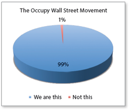
Graphs and charts, while perfect for displaying complex data sets and statistics, can also be used to tell stories and represent ideas graphically. For instance, the pie graph to the right shows a graphic representation of a famous saying from the Occupy Wall Street movement. Many popular Web sites like coolinfographics.org use creative infographics like the example to display interesting ideas and information.
Your Turn
- Choose a current or historical event in government, business, sports, or pop culture.
- Create a visual representation of the event using one of the forms explained in this chapter—graphs, charts, maps, or diagrams.
- Bonus: Create a visual representation of a math, science, English, or social studies concept you are discussing in class.